The brief
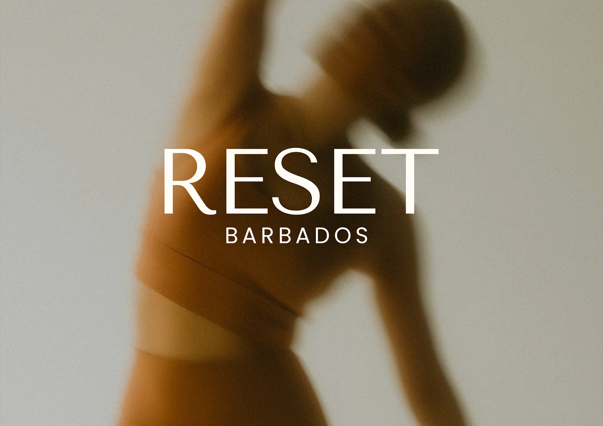
Reset Barbados started as one man's birthday ritual. Every year George switched everything off, no phone, no notifications, just nature, quiet and himself. He wanted to open that up to other people, and needed a brand that could hold two very different versions of the same idea: a rustic, nature-led weekend at Eco Lifestyle Lodge, and a more elevated, coastal edition at Ocean Two Beach Club. Both had to feel unmistakably like the same thing.
We came in as the sole design partner, building the identity from strategy through to logo, colour, type, mood and how it all sits across social, merch and event collateral.
Finding the line
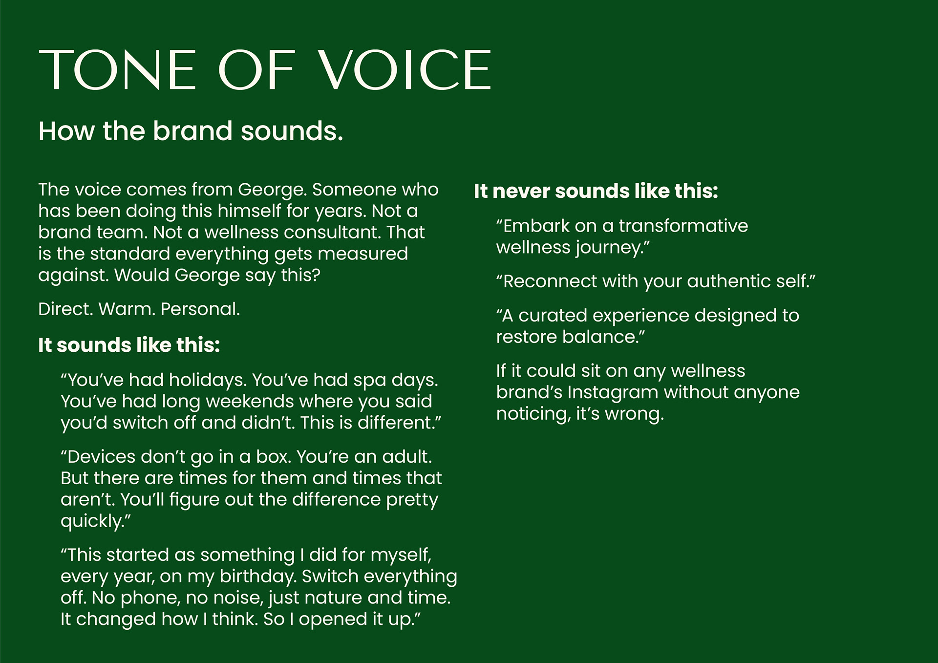
The hardest part of this brief wasn't the visuals, it was drawing a line between wellness cliché and something that actually felt like George. Every direction got run through one question: would George say this? If a line could sit on any wellness brand's Instagram unnoticed, it was wrong.
That gave us the positioning early. Reset is a structured digital detox with real programming, grounded in Bajan culture as the point rather than the backdrop, built for international travellers and local audiences alike. It is not a luxury spa retreat, not a generic wellness festival, not a device-free cult. Guests are adults. They just need somewhere that makes switching off easy.
Exploring the mark
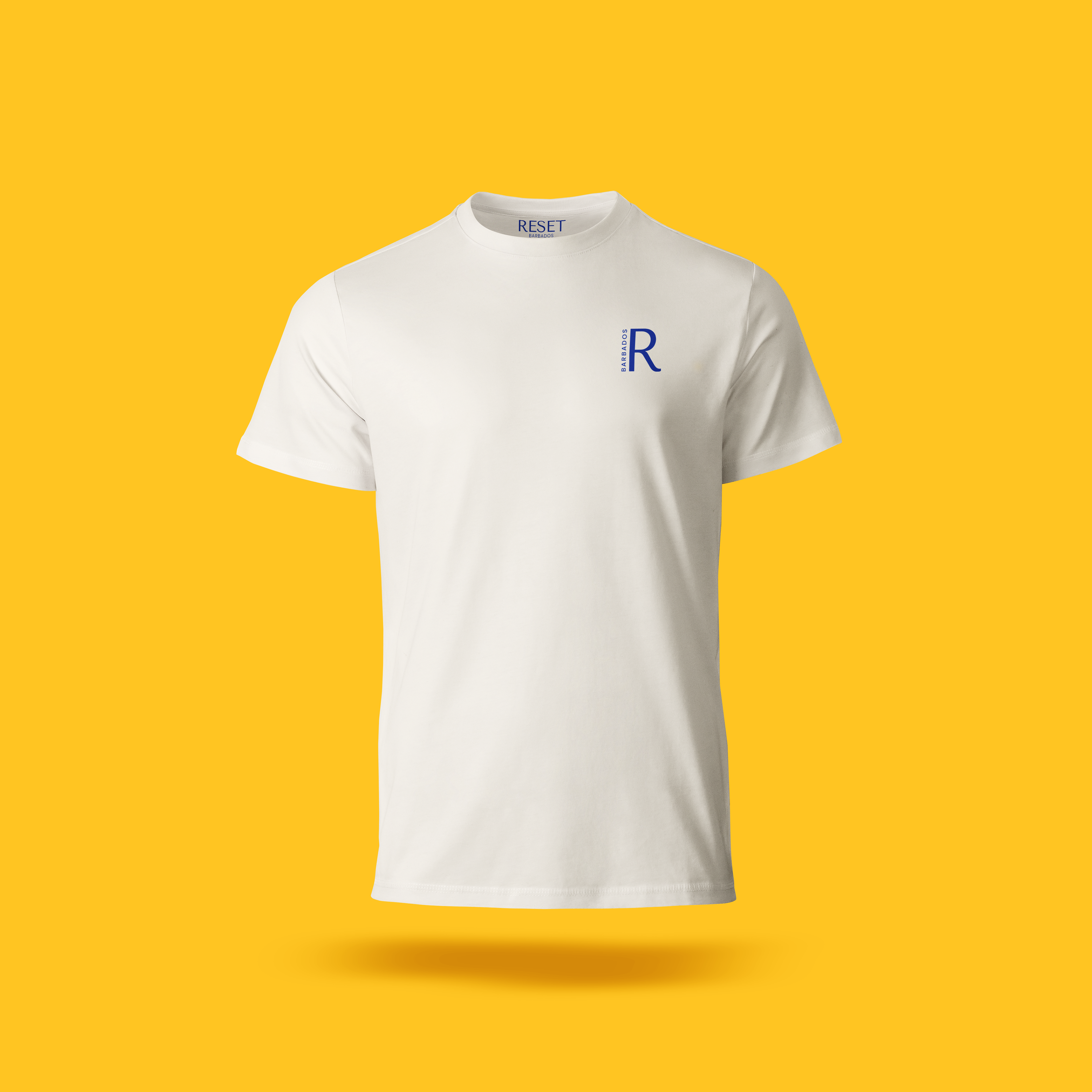
We took the wordmark through several distinct routes before landing anywhere, from a hand-built sunburst emblem that leaned bright and energetic, to a stripped-back serif treatment that let the photography carry the weight, to a standalone monogram R designed to hold its own at small sizes where "Reset Barbados" in full would lose legibility.
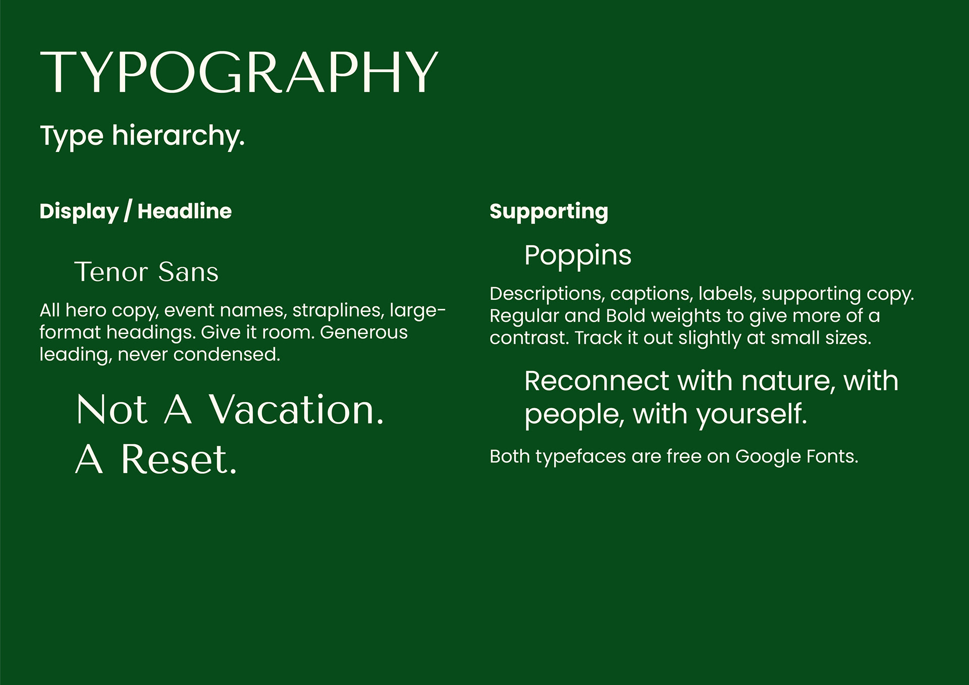
Two routes went furthest. One paired a bold sans wordmark with a hard-edged sun/star mark, Gotham throughout, built for energy and immediacy. The other stripped everything back to Tenor Sans for display and Poppins for supporting copy, letting a quieter monogram and warmer photography do the talking. The second is what carried through to the final guidelines.
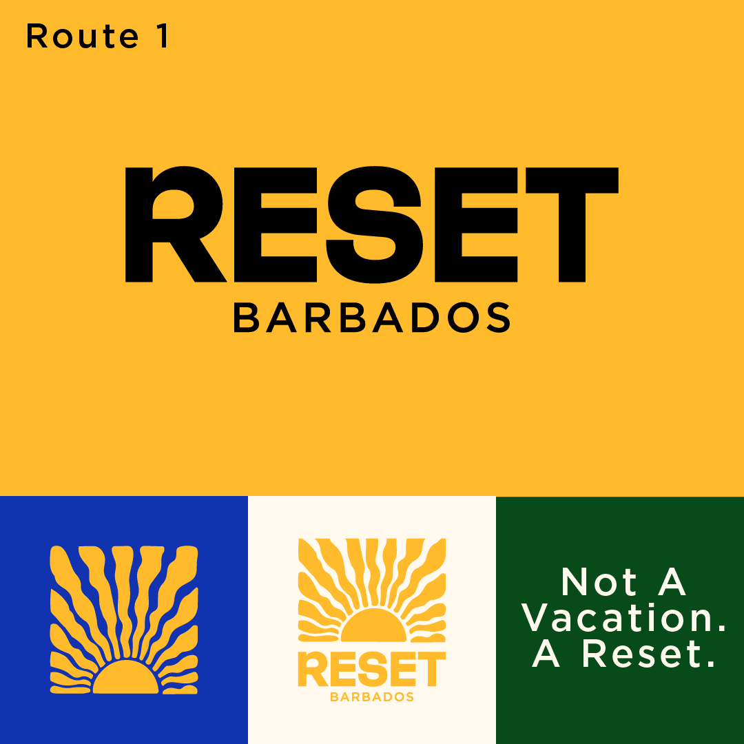
Reset Barbados logo exploration, Route 1: bold wordmark with sunburst emblem on yellow, plus sun mark, monogram and "Not A Vacation. A Reset." strapline
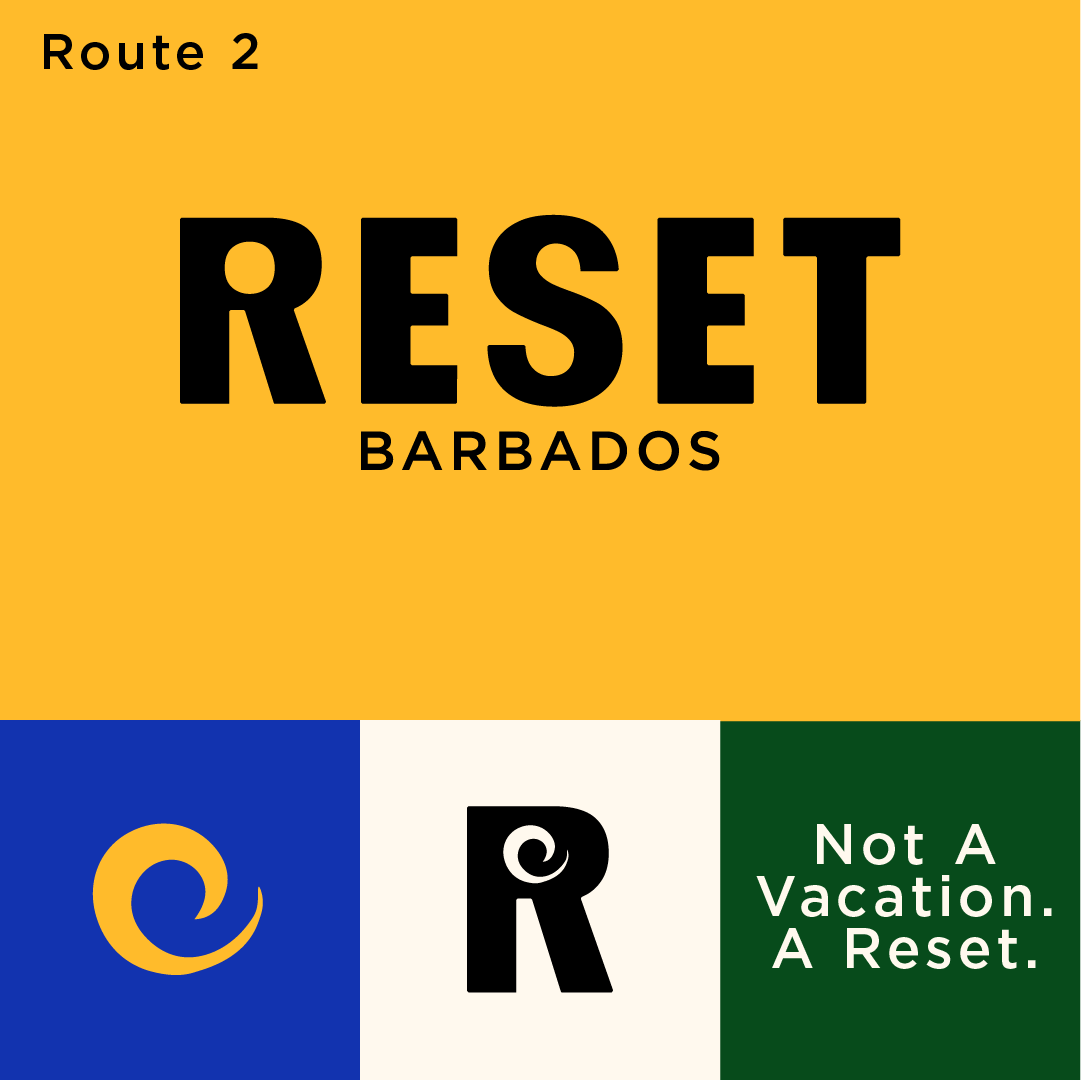
Reset Barbados final logo system, Route 2: wordmark with spiral icon, R monogram, and "Not A Vacation. A Reset." strapline
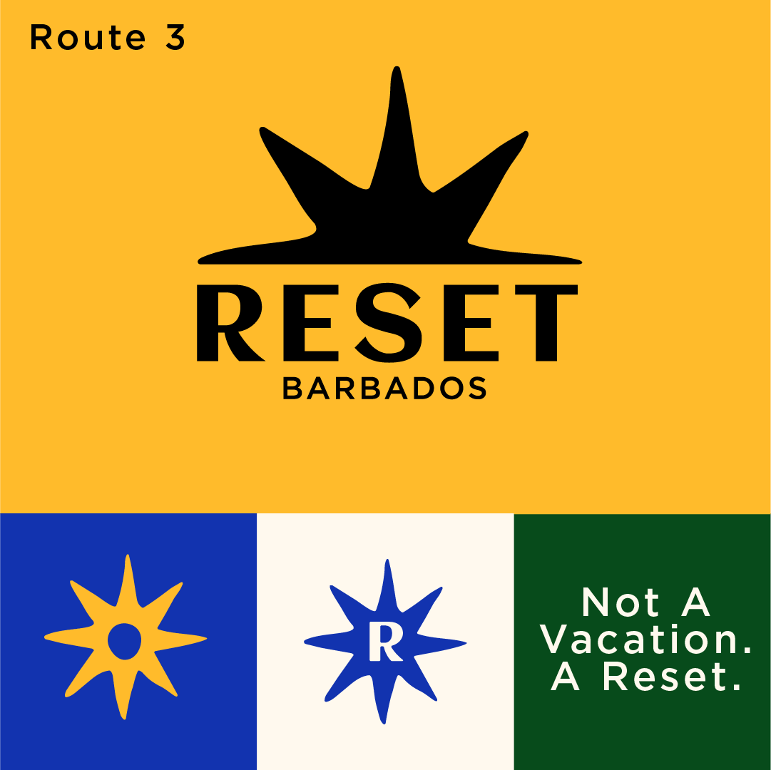
Reset Barbados logo exploration, Route 3: wordmark with hard-edged star burst mark on yellow
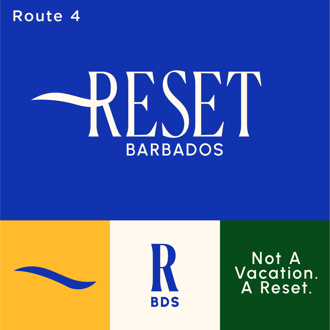
Reset Barbados logo exploration, Route 4: serif wordmark with wave flourish on blue, wave icon and "R BDS" monogram
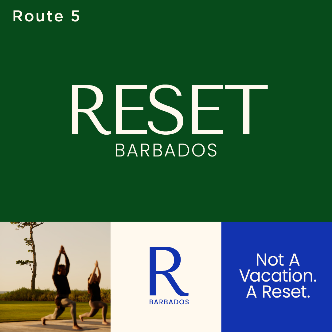
Reset Barbados logo exploration, Route 5: serif wordmark on green, with outdoor yoga photography and R monogram
The system
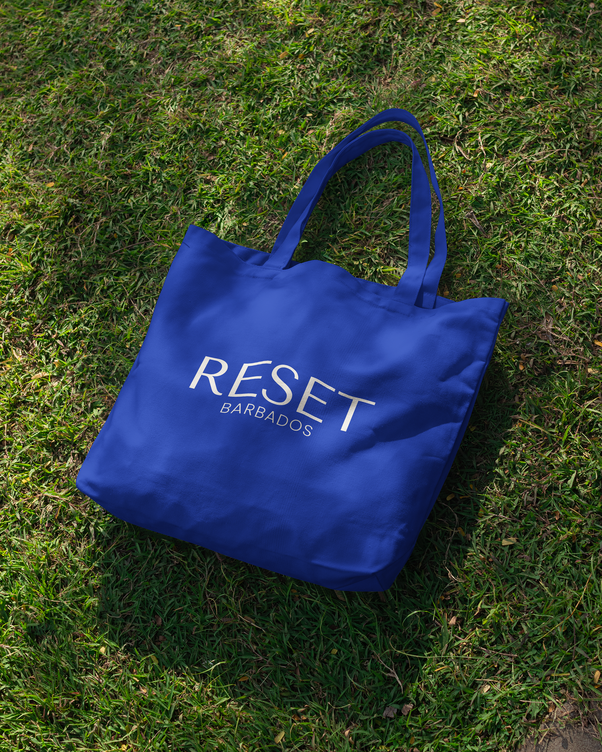
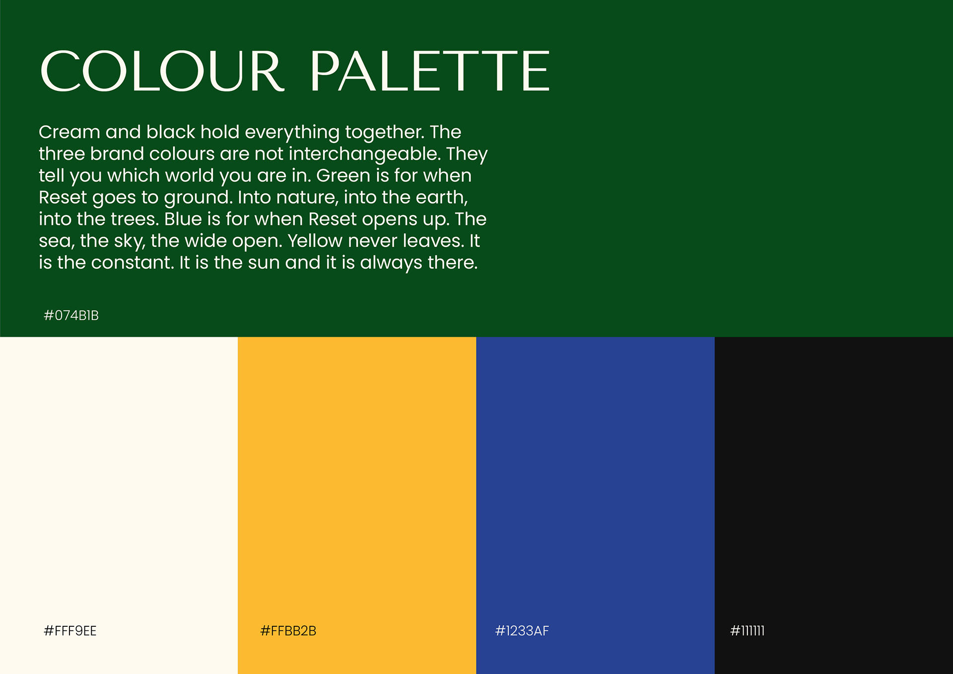
Cream and black hold the identity together. Three colours then do the work of telling you which world of Reset you're in: green when it goes to ground, into nature and the earth; blue when it opens up, the sea and the sky; yellow as the constant, always present, always the sun.
The logo strapline, "Not A Vacation. A Reset.", is George's line, kept verbatim. Everything else in the system was built to earn its place next to it rather than compete with it.
Where it lives
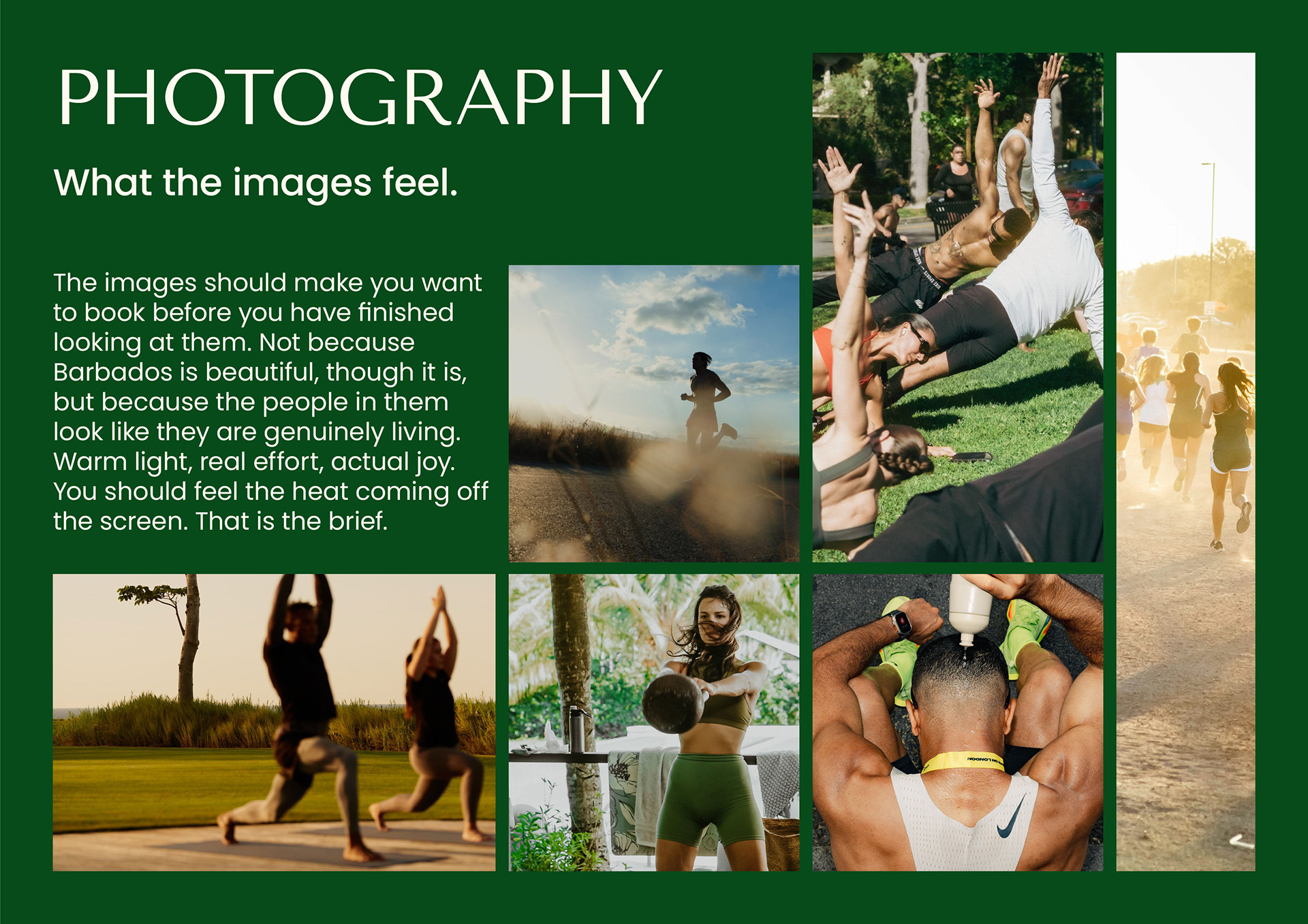
Because the brand covers two tiers with two audiences, we built it to flex rather than duplicate. The wordmark, colour and type stay fixed across both event strands, Eco Lifestyle Lodge and Ocean Two Beach Club. Only the art direction and photography shift. That also means the system is built to travel. Reset Trinidad or Reset Jamaica would need a new subline, not a new brand.