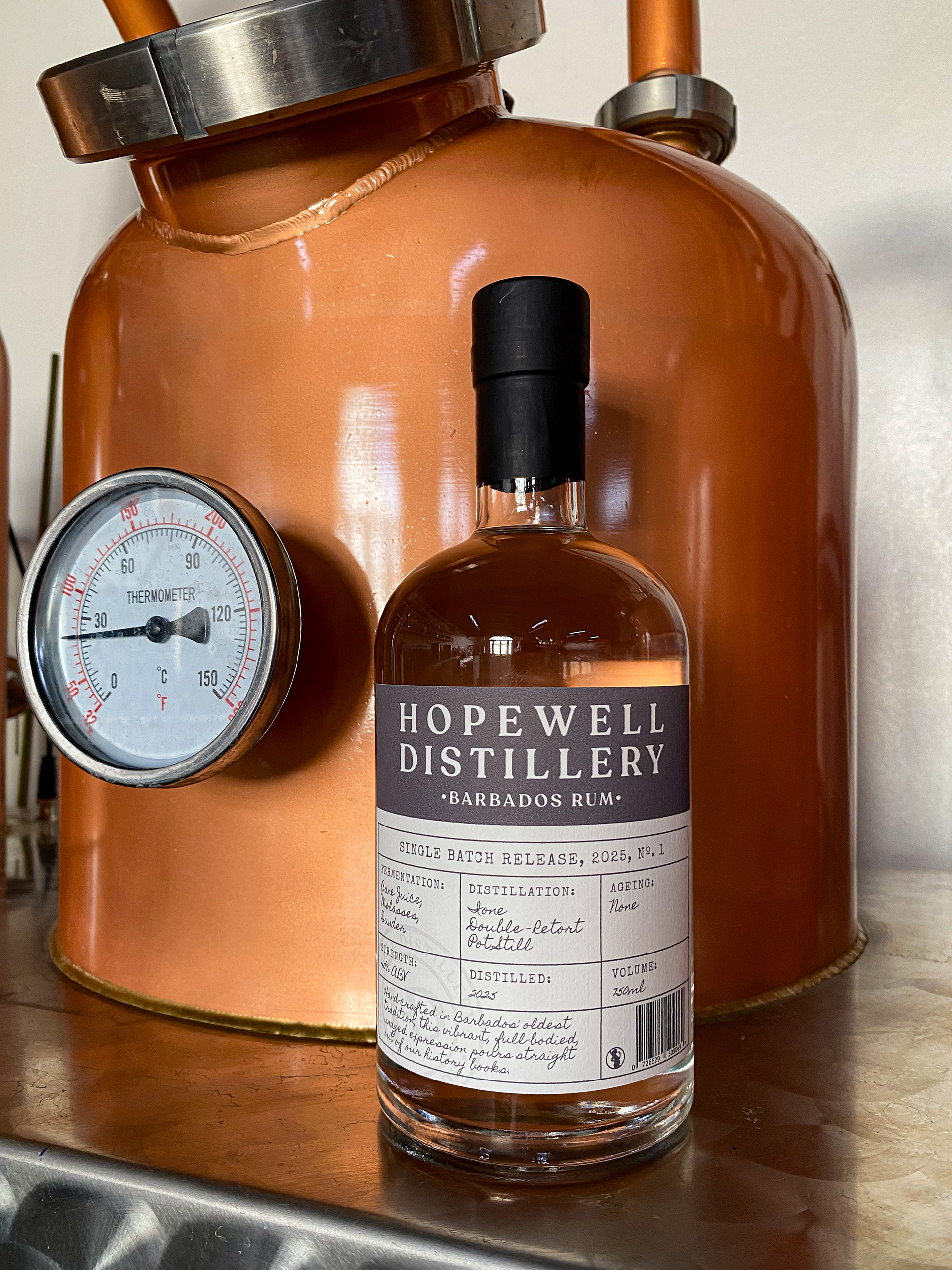
Hopewell Distillery's first Single Batch Release rum bottle with brand new label
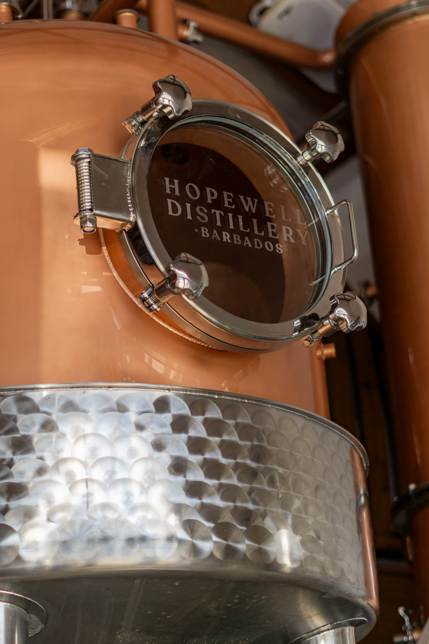
Hopewell Distillery copper still
Built for a Place, Not a Brief
Hopewell Distillery sits on a historic estate in Barbados that's been in the Perkins family for generations. When the family decided to convert the old sugar factory into a working distillery, producing gins, vodkas, and small-batch rums, they needed a visual identity that carried that weight without feeling heavy. The brand had to feel like it belonged to the land, without looking like it was stuck in the past. And it had to be a system, one flexible enough to stretch across signage, packaging, and digital as the distillery grows.
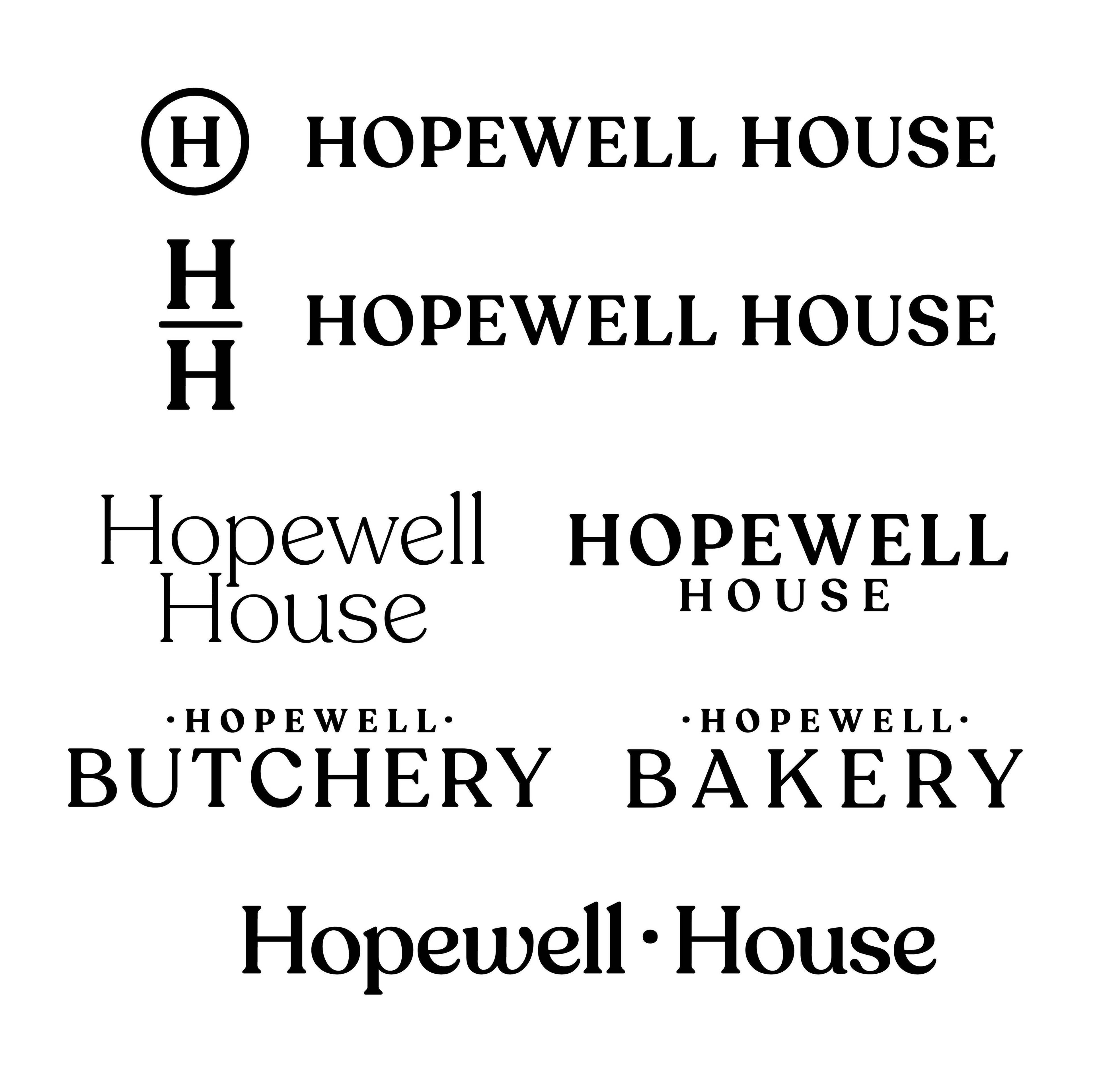
Finding the Mark
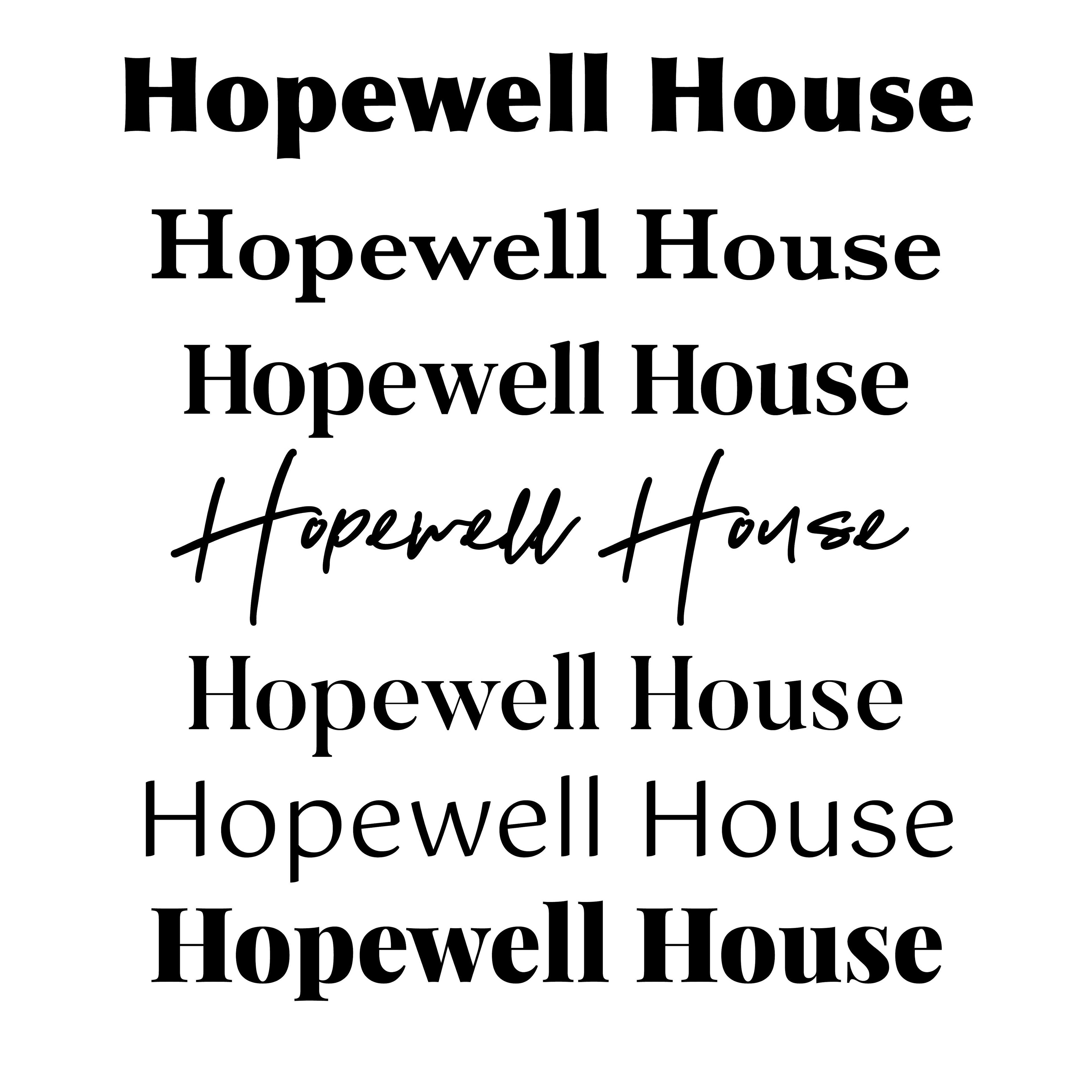
The wordmark is set in Recoleta, a choice I kept coming back to across dozens of sketches. Its soft serifs and fluid stroke weight do something rare: they feel both historical and warm, credible but not austere. Hopewell needed to sit clearly in the spirits world without mimicking it.
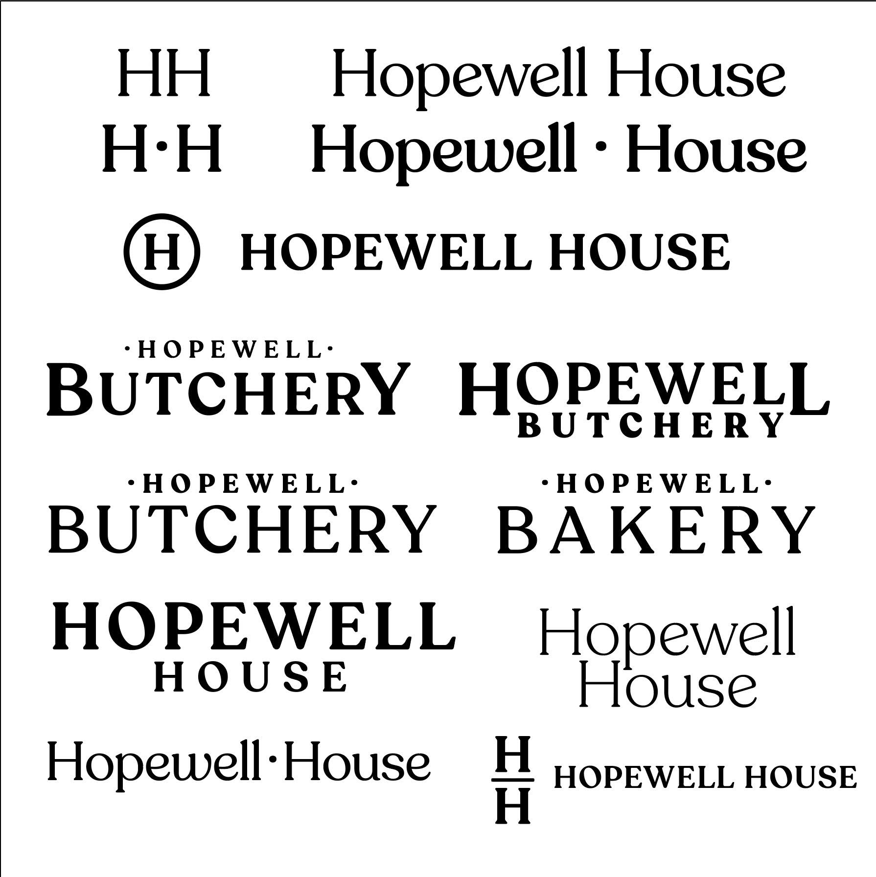
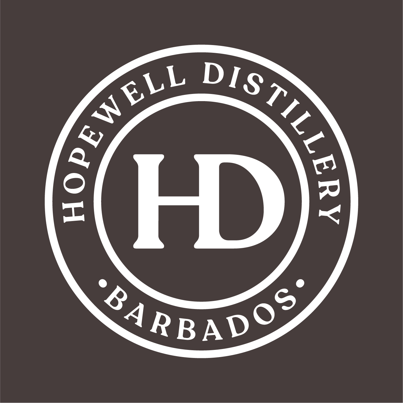
Alongside the wordmark, I built two supporting elements. The HD lockup, a compact secondary mark for tighter applications. And a heritage stamp, a circular emblem with "HD" at the centre, ringed by "Hopewell Distillery Barbados." On labels, the stamp is placed slightly off-axis, a deliberate choice that reads like something pressed by hand rather than printed by machine. That small decision carries a lot of the brand's character.


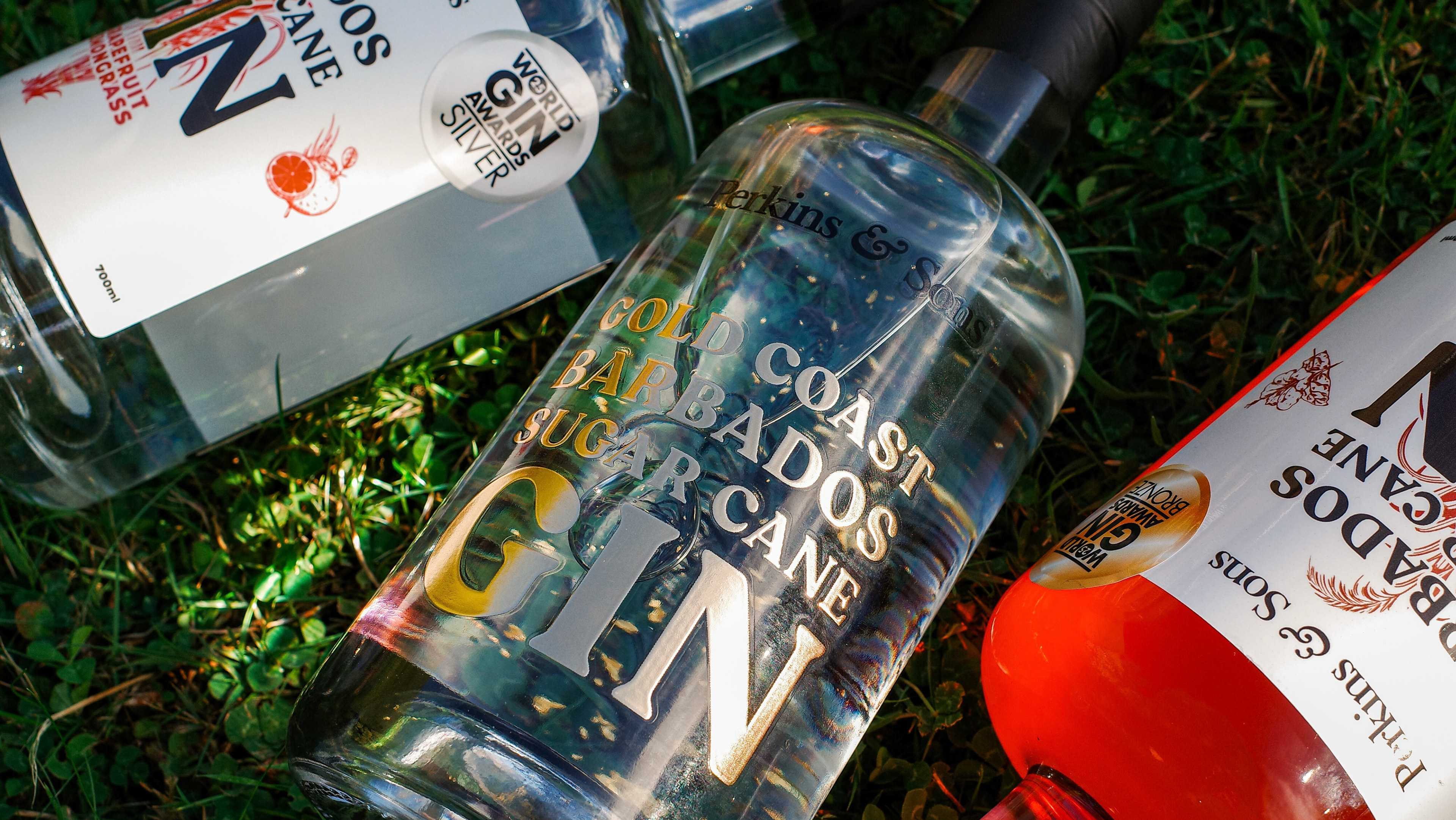
100 Bottles
The first Single Batch Release came with only 100 bottles. I treated that scarcity as the brief. The label layers handwritten and typewriter-style type with the distillery's mark and a warm brown drawn from the colour of molasses. Paper texture, deliberate misregistration, time-worn detail. The result is something that feels made rather than manufactured, which is exactly right for a first release with that kind of story behind it.
A System That Can Grow
The identity is built to outlast the first product line. The roundel, the material palette drawn from the steel and brass of the stills, the typographic hierarchy, all of it is structured to carry sub-brands and new expressions without losing coherence. Hopewell has a long story. The brand system is designed to keep telling it.
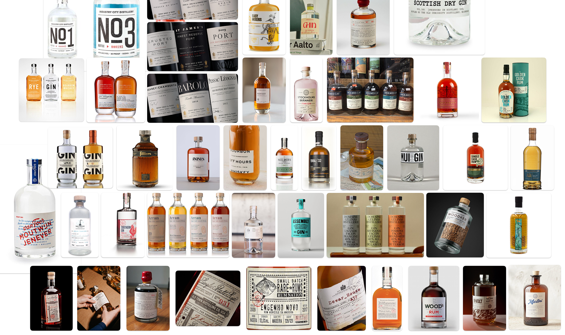
Hopewell Distillery moodboard
How It Actually Works
Most of the creative conversation with founders Greg and Vicki happened over WhatsApp. Concepts shared as sketches, feedback in voice notes, decisions made in real time. It's an informal process, but it's a precise one. When the people commissioning the work are that close to the subject, the design gets sharper for it.
I Grew Up There
I grew up going to Hopewell. I watched the old sugar factory sit empty for years, and then watched the family turn it into something alive again. That history isn't background context for this project. It's the reason every decision had to be right. Designing for a place you know changes how you work.