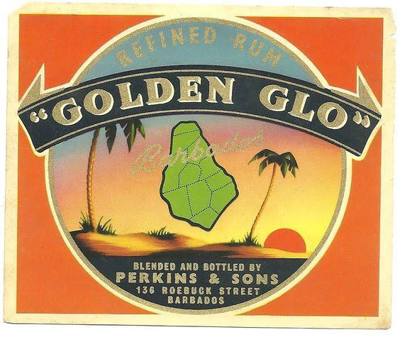
Original Golden Glo Perkins & Sons rum label
Perkins & Sons is an 80-year-old Barbadian rum house that spent decades out of circulation. In 2018, my father Greg Cozier made the decision to bring it back. From that moment I've been the only creative on it, building the brand from the ground up and evolving it through every iteration since, rum first, then gin, then vodka, and eventually into a whole new brand on the same family estate: Hopewell Distillery.
There's no brief to interpret here, no client to align. Just the brand, its history, and a responsibility to get it right. That's a different kind of creative accountability, and it shows up in the work.
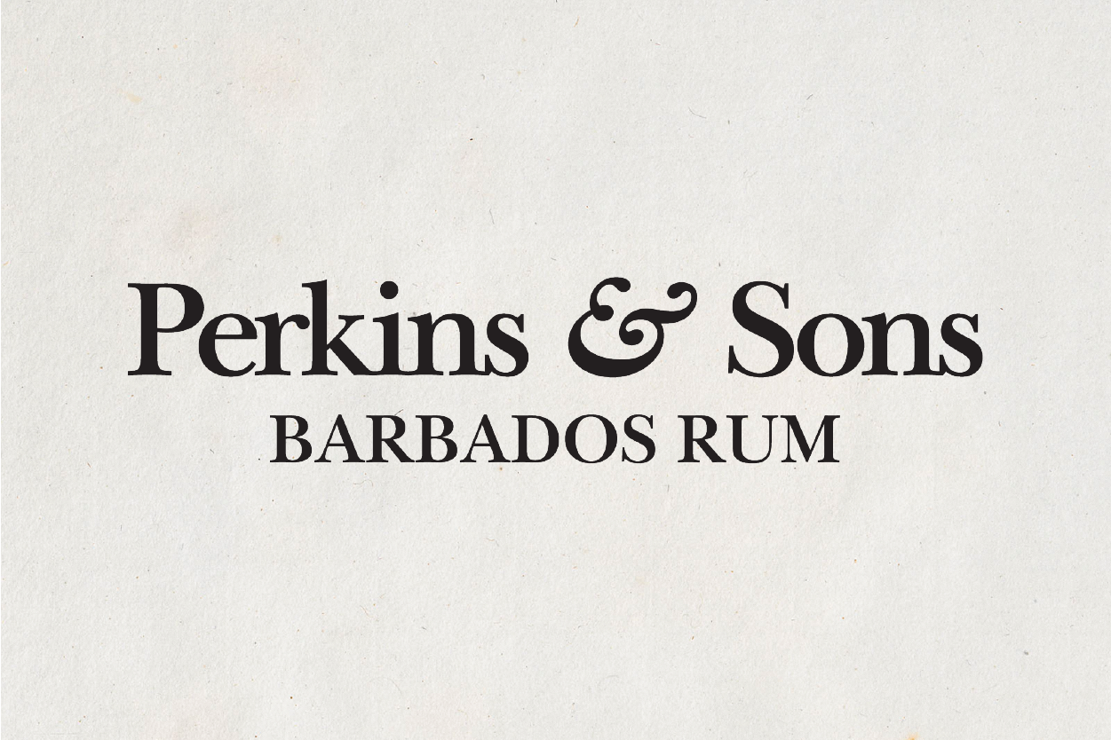
The Logo
The original Perkins & Sons mark had history behind it, but it wasn't carrying the weight of the brand it needed to become. The rebrand started here. The new logo needed to feel established without looking preserved. It had to work on a label and on a rally car, in gold foil and on a phone screen. The typeface and detailing were chosen to sit clearly in the premium spirits world while remaining distinctly Barbadian.
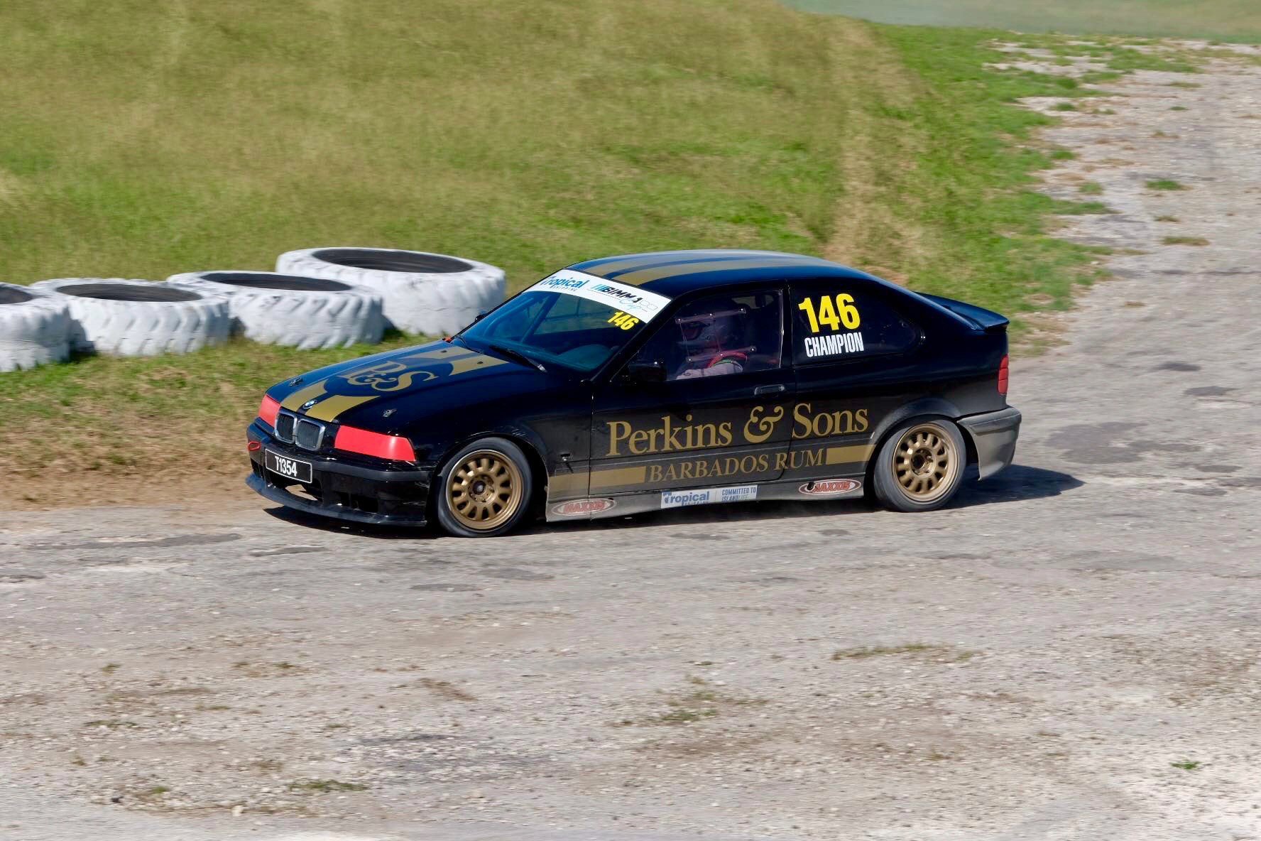
Perkins & Sons proudly sponsored a car at Rally Barbados, celebrating the island’s motorsport heritage and the precision, passion, and craftsmanship that reflect our brand values.
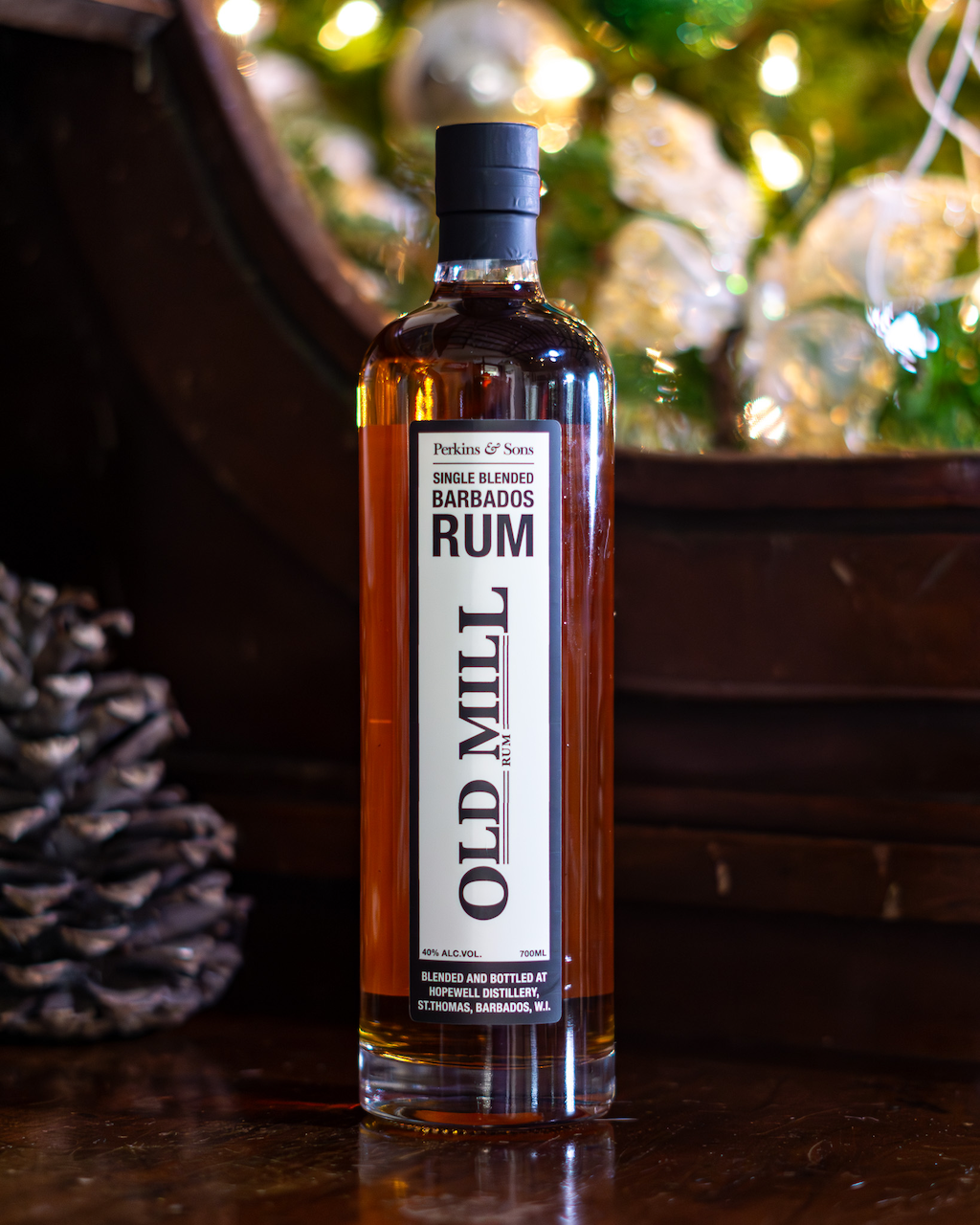
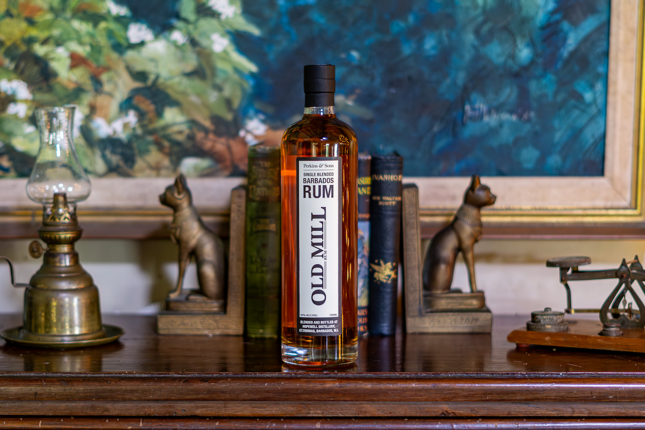
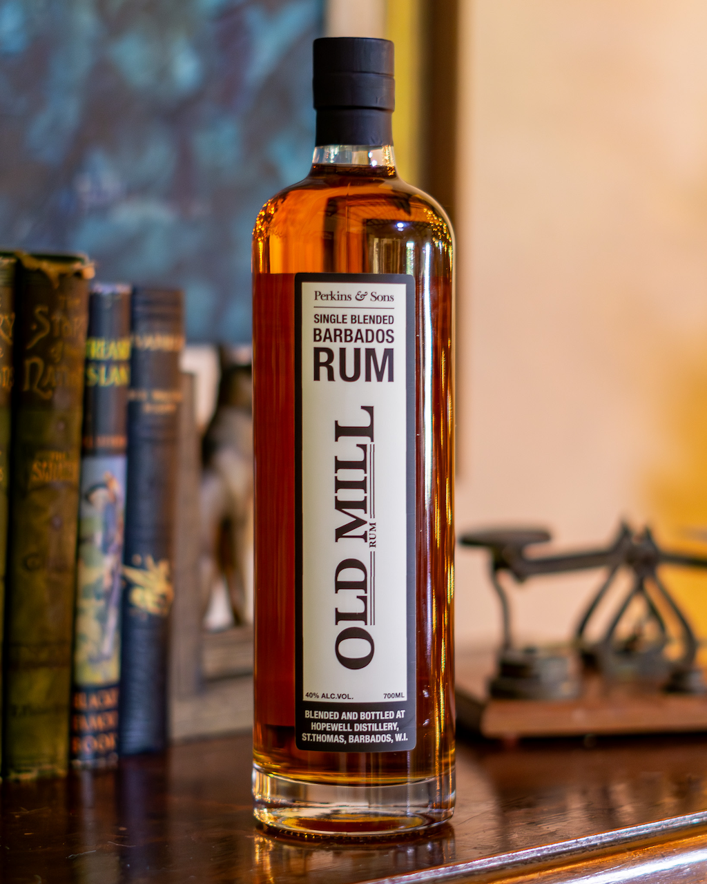
OLD MILL RUM
Old Mill was a new addition to the Perkins & Sons range, not a revival of something that came before. The challenge was making it feel like it had always belonged, credible within the brand's heritage without pretending to a history it doesn't have. The label pairs a heritage-style mark with clean, contemporary typography to strike that balance. Too much nostalgia and it reads as pastiche, too much modernism and it loses the warmth the brand is built on.
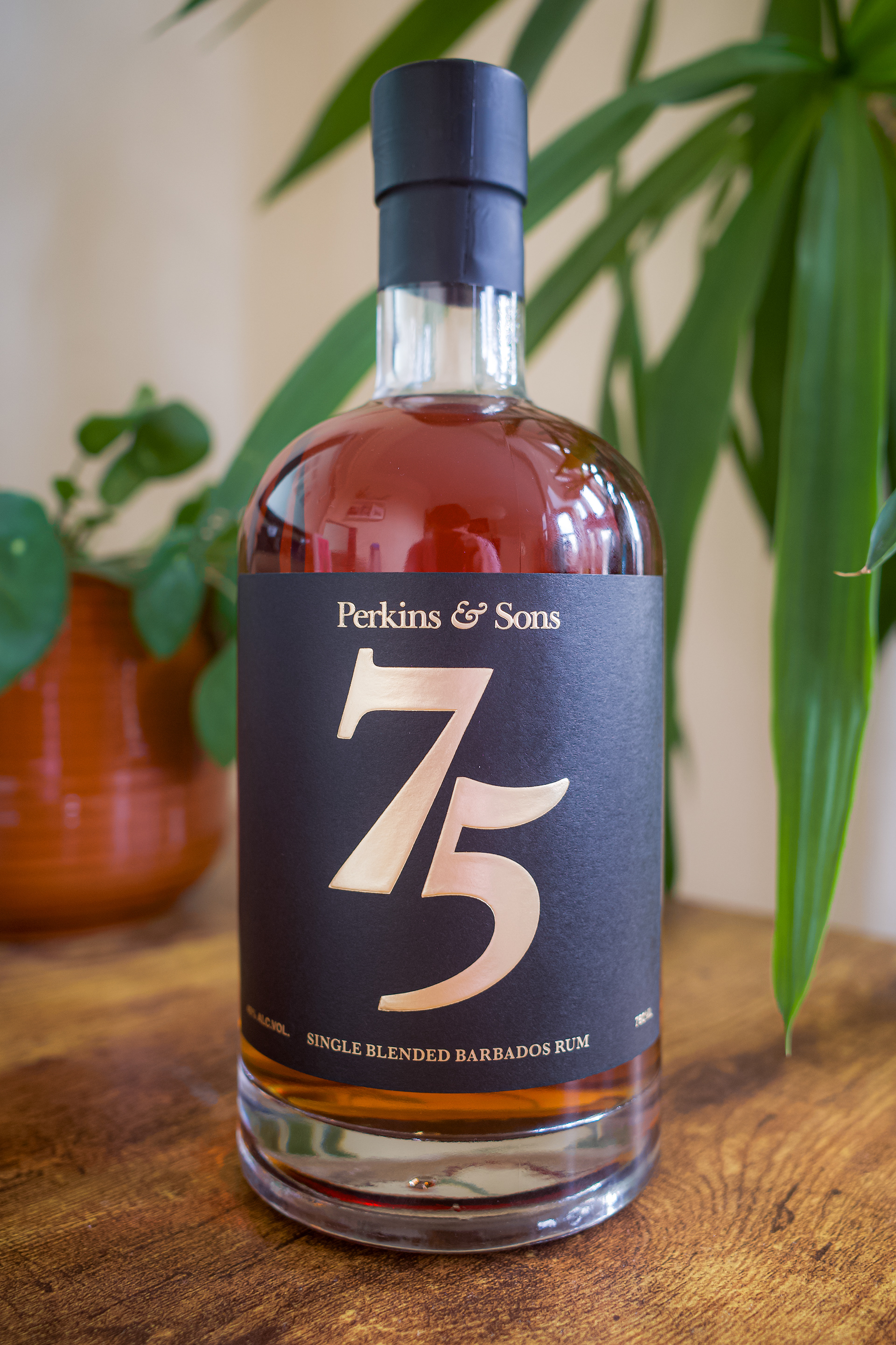
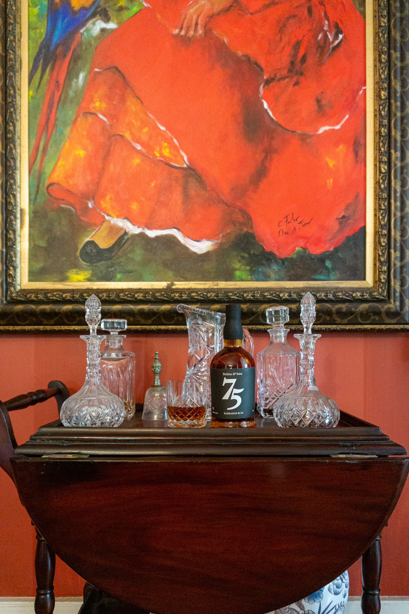
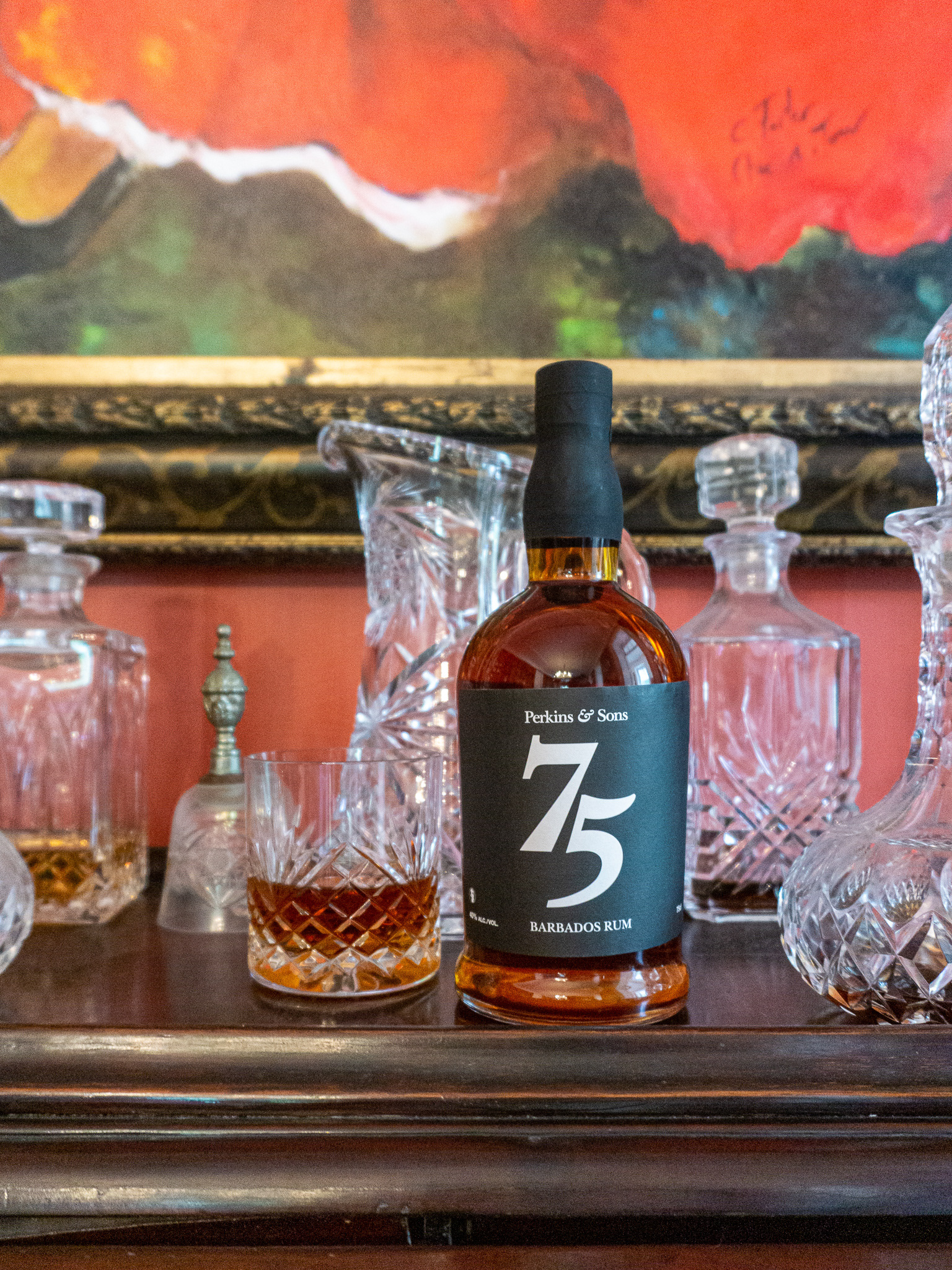
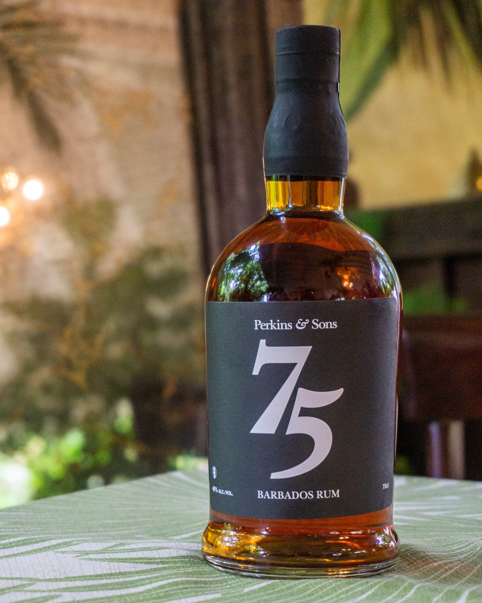
Perkins & Sons' 75 rum with our brand new gold lettering label
75th Anniversary Edition
For the brand's 75th anniversary, I led the concept, design, and photography of a commemorative 12-Year Rum release. The label is printed on deep black stock with gold lettering. No illustration, no pattern work. Just weight and restraint. I art directed and shot the product on location at Lancaster Great House, a setting chosen deliberately for what it says about age and provenance. Those images ran across web, print, and social.
Taking the Brand into Gin and Vodka
Extending an 80-year-old rum brand into gin and vodka without it feeling like a stretch required a clear system. The two launches took different directions, deliberately.
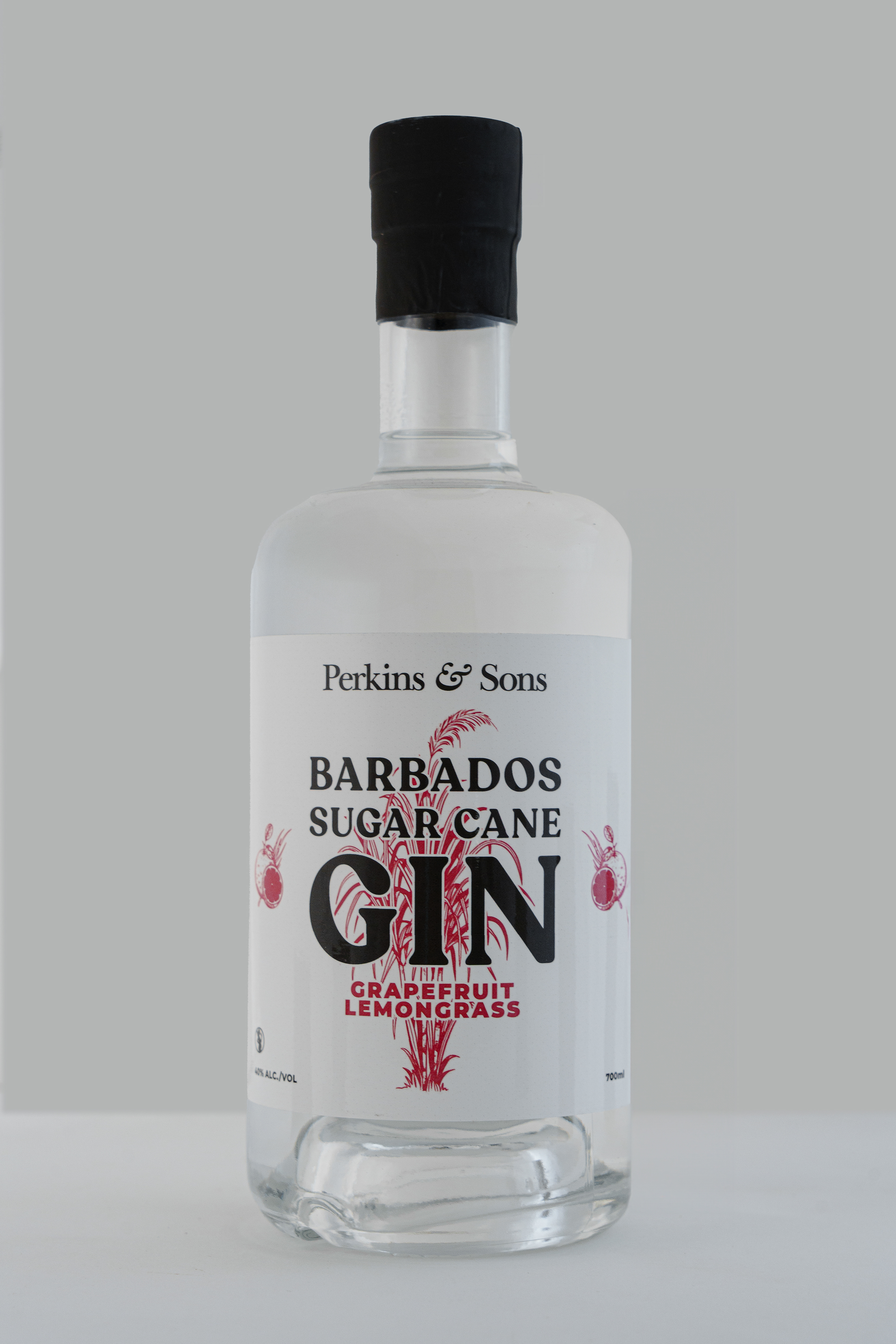
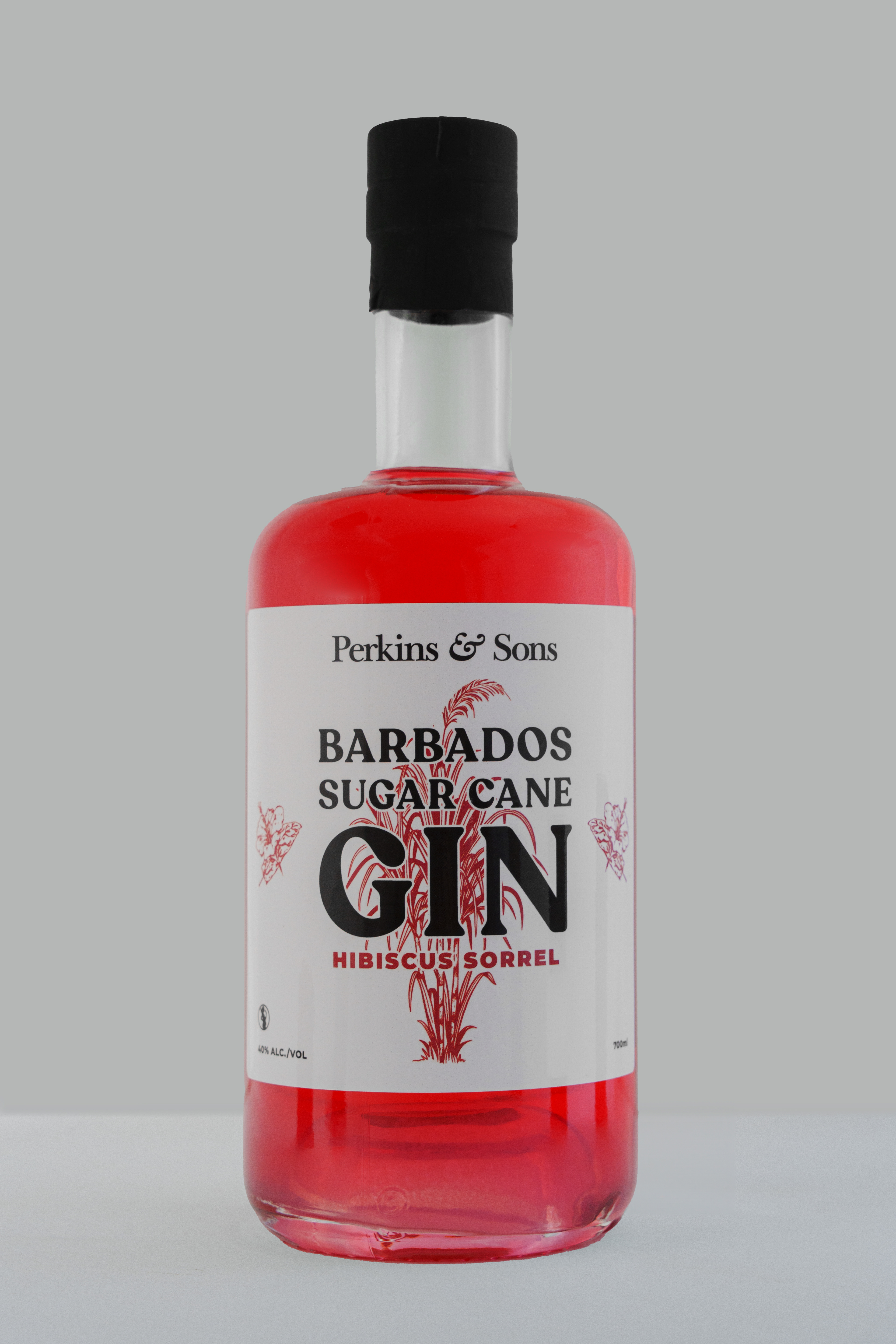
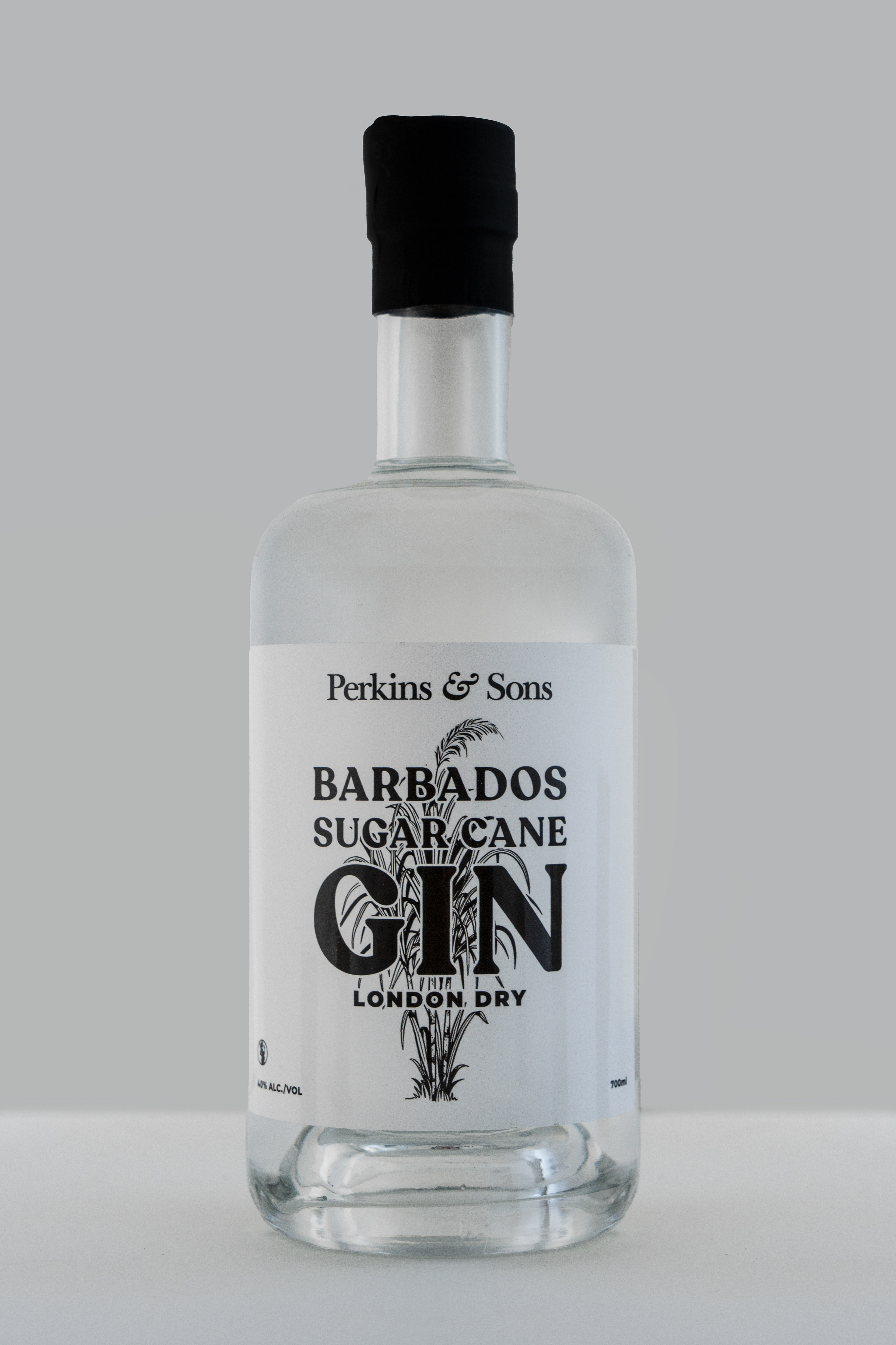
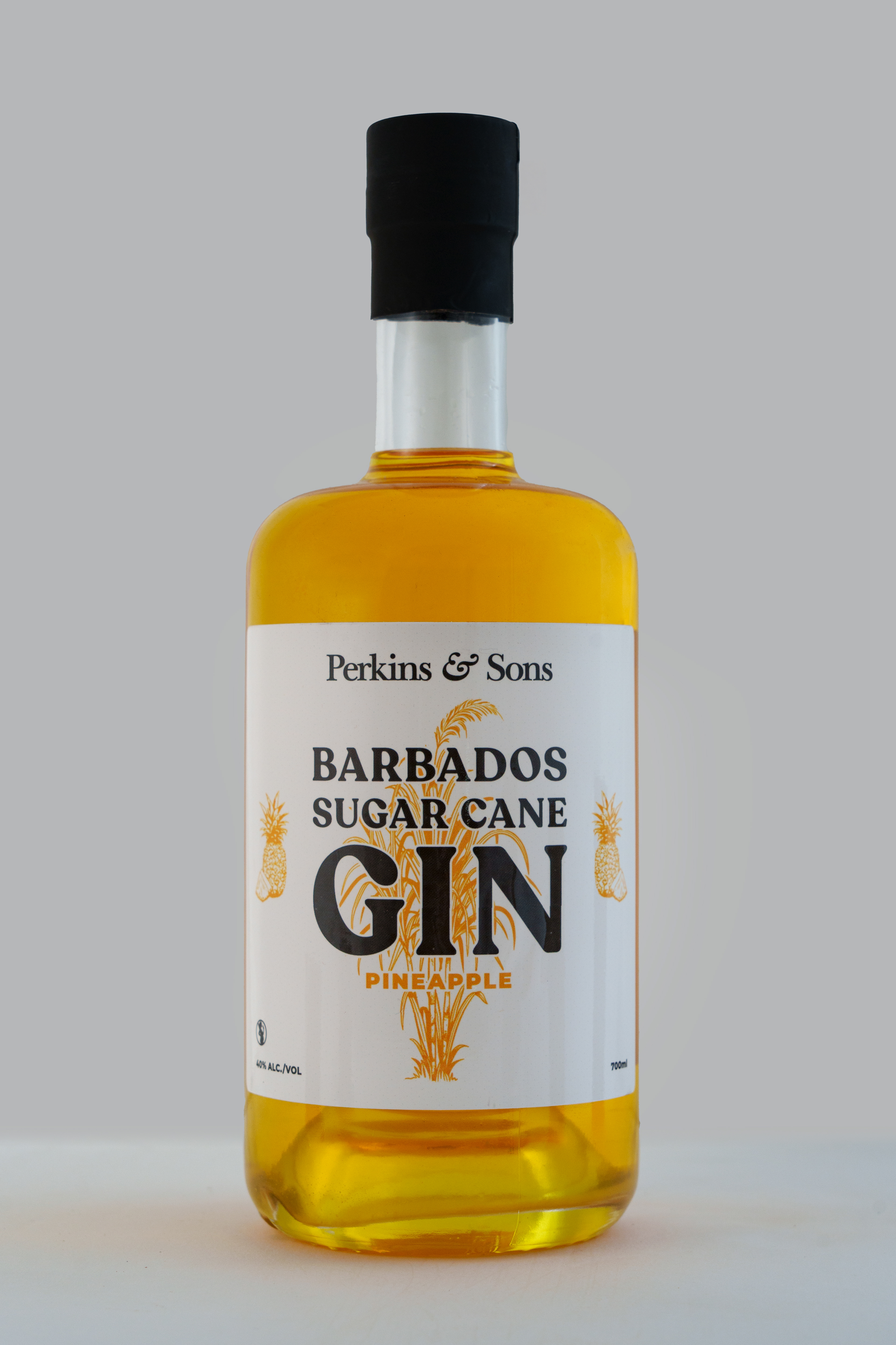
For the Sugar Cane Gin, I art directed a series of etching-style illustrations in collaboration with Bajan artist Nicola Barnard Blades. Every detail was briefed and refined, then built as vector artwork so it could scale across packaging, campaigns, and digital without losing integrity. The result is rich, craft-forward, and rooted in the island.
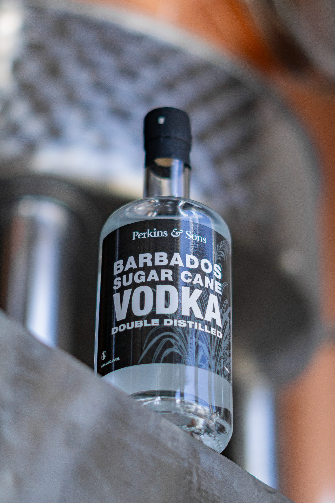
The vodka label goes the other way: minimal, high contrast, black base. It's aimed at a younger, more style-conscious buyer, but it still reads as Perkins & Sons. The two products speak different dialects of the same visual language.
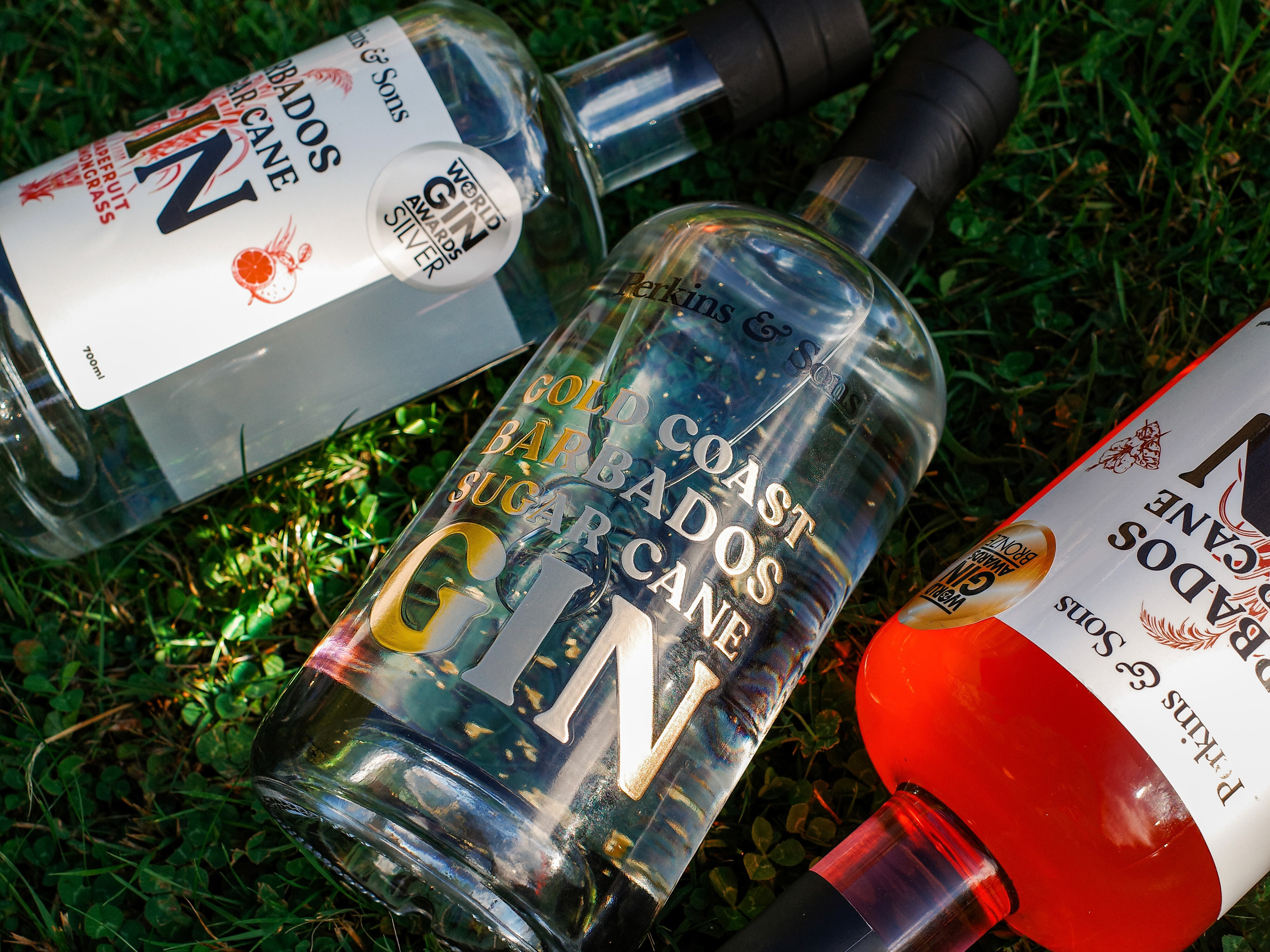
Perkins & Sons award-winning gin, Grapefruit Lemongrass and Hibiscus Sorrel, with Gold Coast Gin
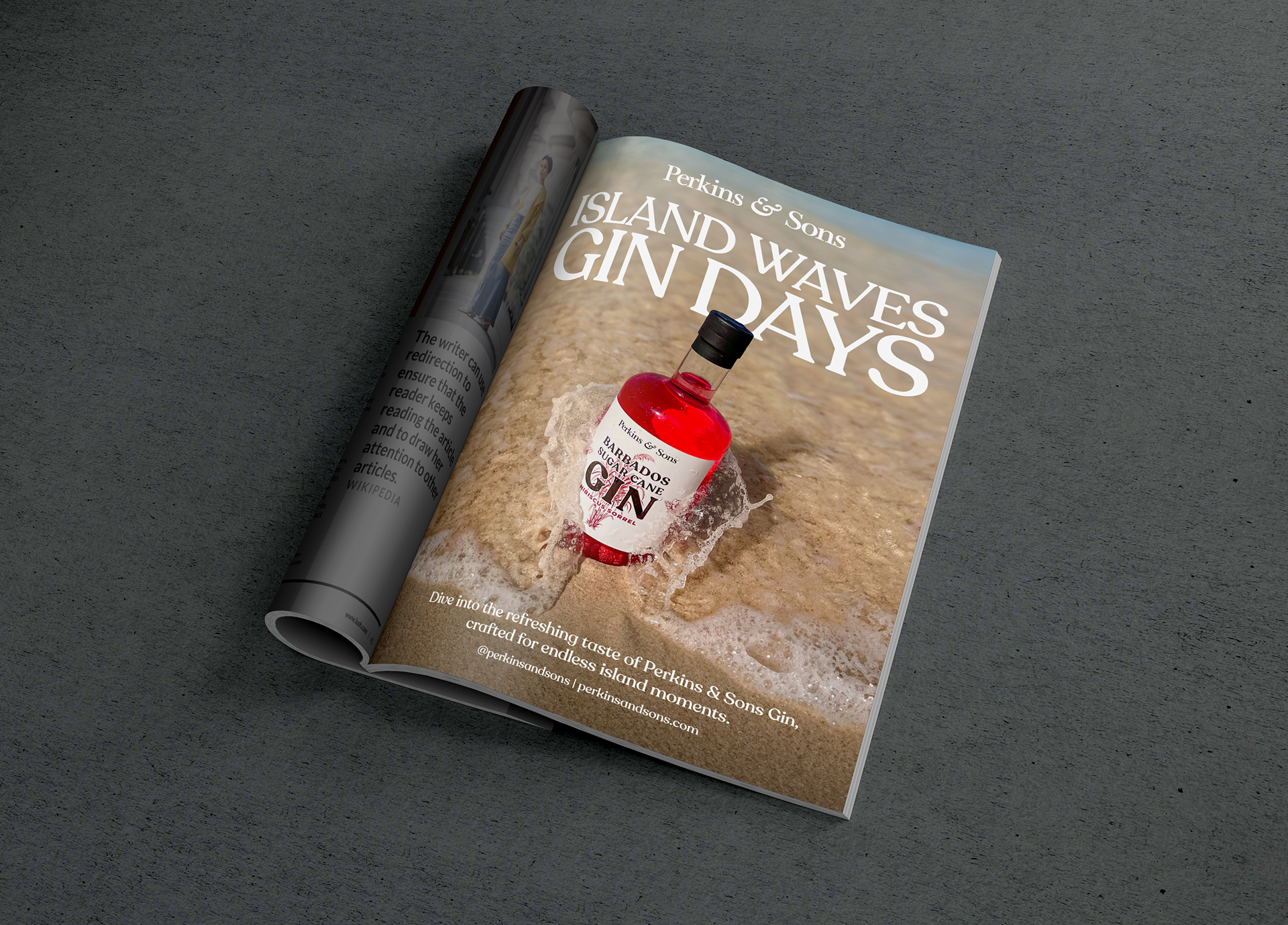
Wine World Christmas 2024 Single Page advert
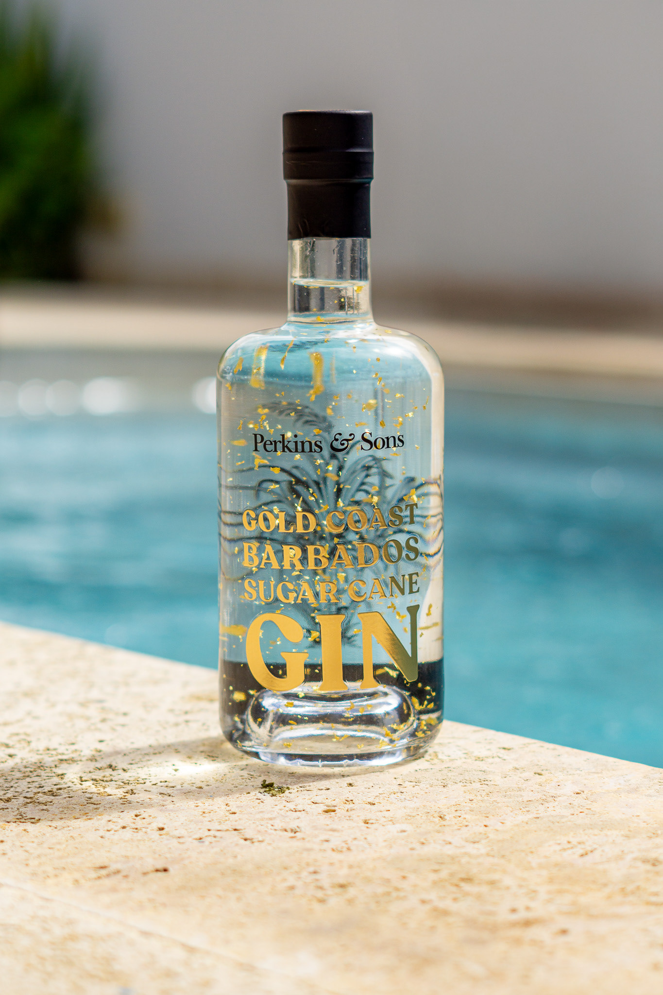
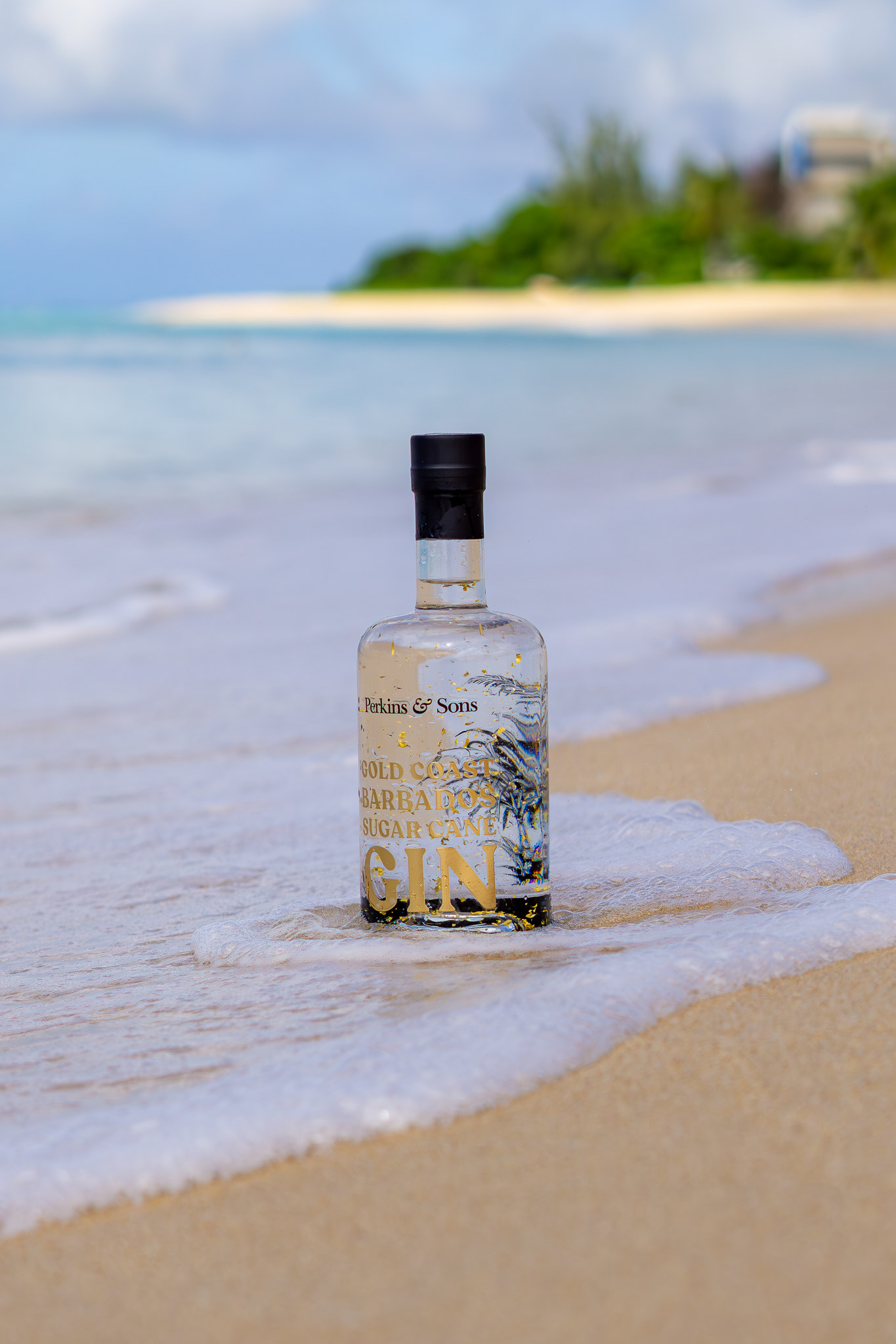
GOLD COAST GIN
Gold Coast Sugar Cane Gin called for a different register: coastal, sun-lit, unapologetically indulgent. I built the visual identity around gold as a central element, not as decoration but as the primary design decision, chosen to echo the light on the water and position the bottle as something you'd want on a shelf as much as in a glass. I shot the photography to match: warm, open, relaxed but considered.

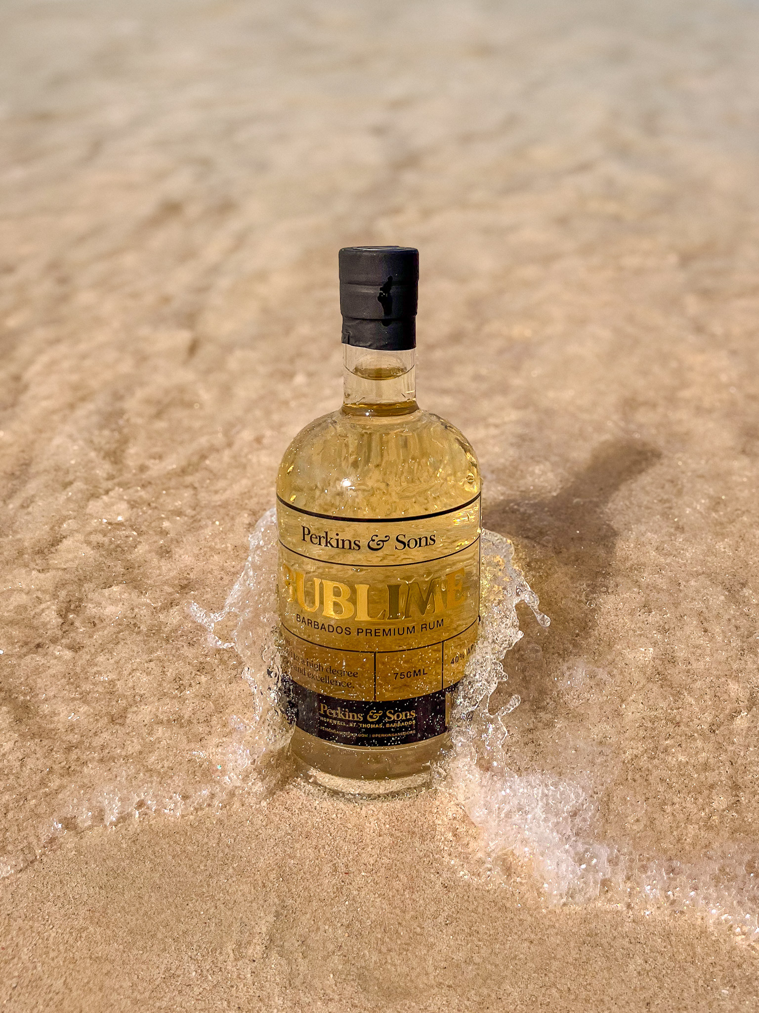
Sublime White Rum
Sublime is a return to first principles. White rum, made the way Barbados has always made it. The label reflects that: minimal, clean, with metallic accents that gesture toward craft without overstating it. I led the brand, label design, art direction, and photography. The brief was essentially purity, and every design decision pointed back to that.